|  
The Relatives and Residents Association’s
(R&RA) previous logo was ‘home-made’ and looked
old fashioned and unprofessional. The charity’s name
didn’t really explain what they do — to support
and advise older people in long term care and campaign for
improved standards.
em was commissioned to rebrand the organisation's identity:
we created a new logo using the (far more contemporary) abbreviation
and charity’s strapline to neatly explain
R&RA’s work and to bring the organisation into the
21st century.

Leaflet
aimed at multi-cultural home users
Working
ideas for logo
|
 |

| The
rebranding exercise also included setting up design and
typographical styling for briefing papers, leaflets and
longer reports. |
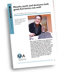 
Information
paper (above) and report (right)
|